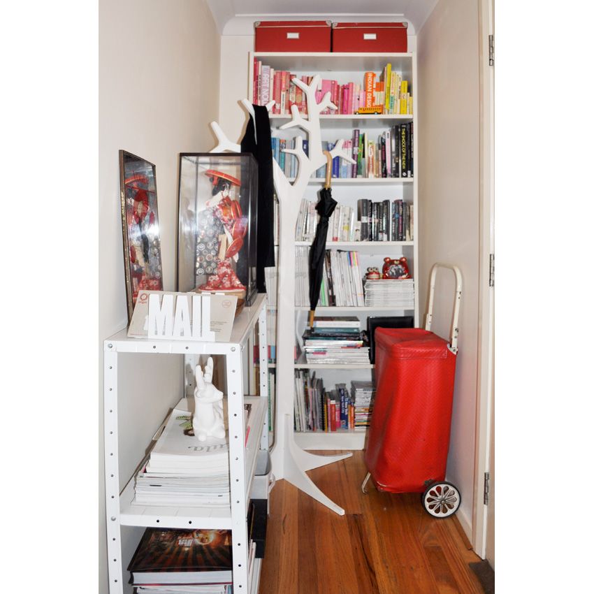
Welcome to our home, please leave your coat by the front door on our tree shaped hat stand. There is a funny story about that hat stand which you can read about here. You can also see I have always been obsessed with entry hallway's, having made three posts about them back in 2008 here, here and here (FYI Henry broke my beloved Jenny Kee vase featured in that last hallway post). I guess why I am so obsessed with the entrance of a home is because its the first thing you see when you walk in, and I want mine to have that wow factor. You may recognise the white metal shelf, that piece used to sit in our kitchen in our Melbourne home as a display of all my favourite (at the time) red kitchen stuff, and it used to be much taller. Then in our 1st Sydney home it was in my office as extra storage for all the mess working as a stylist generates. The great thing is the shelf is adjustable and comes in two pieces so we were able to make it two shelves instead of just the one so it could work with our new Sydney pad. The first section sitting in our hallway and the second on the balcony as a plant stand.
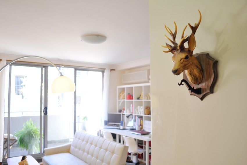
If you follow me on twitter then you would know we recently had to move house as our lease was up (never again will we sign a 9 month lease, but being new to Sydney at the time we didn't know any better and needed a place ASAP). Well the new place is absolutely tiny, about a third of the size of our last place and a lot smaller than our old Melbourne apartment, but what initially scared us about this place has made us fall in love with it. By placing furniture in defined zones, downsizing a few items and keeping to a clean white colour palette I think we make the most of the tiny amount of space available. In a way its a very Japanese way of living, our apartment wouldn't look out of place in Tokyo (but the rent in Tokyo would be much cheaper, much much much cheaper!).
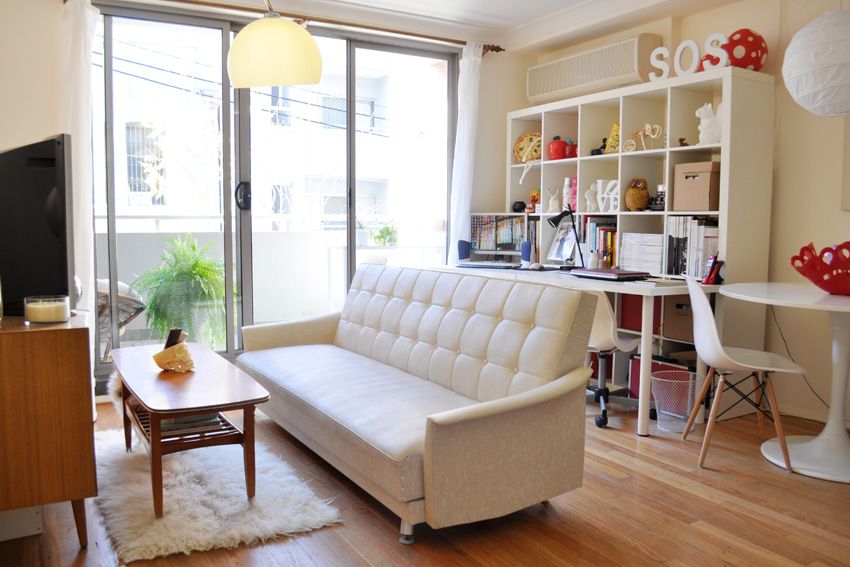 |
| Vintage Danish Sideboard bought in Melbourne at Clear iT on Brunswick Street back when it used to also sell vintage furniture, for around $300. Vintage Danish Coffee Table bought on ebay for $5. Ikea Flakati rug $39.99. Vintage white sofa bed from ebay for under $100. |
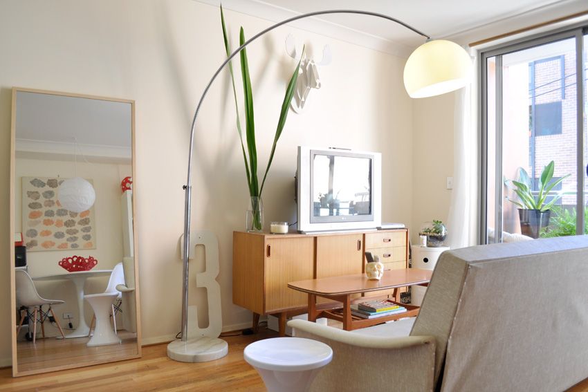 |
| The white stool in the mirror is a new buy from Kmart, and for only $5. I have one in the bedroom as my dressing table stool and we have one outside on the balcony as a plant stand. |
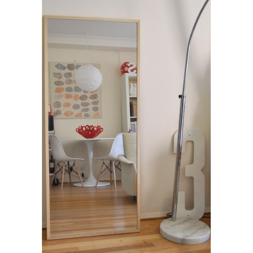
As the space is so small we only have two dining chairs, but we do have four white ikea folding chairs that sit in the gap between the fridge, utilising empty space and perfect for when guests come over.
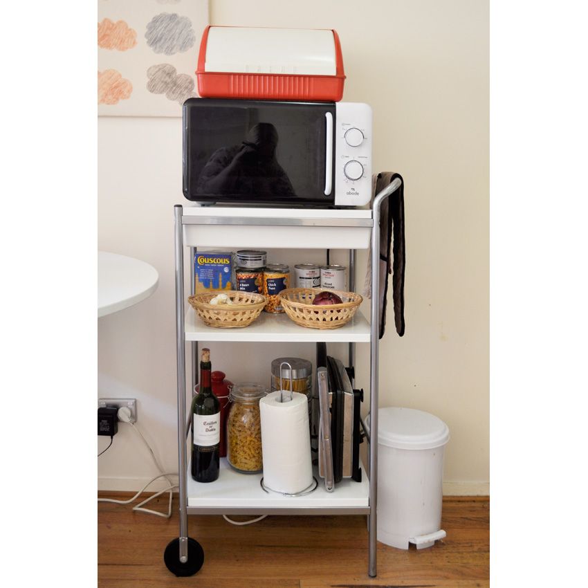
The new place didn't have a pantry, or any room for our microwave, so we bought this cute little Ikea Bygel kitchen trolley for $49.
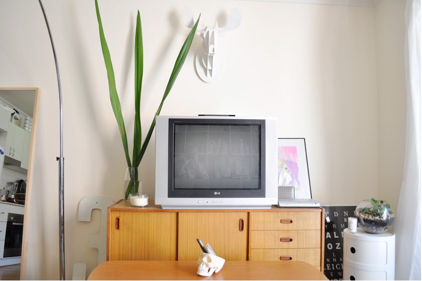
Our tv is a few years old and non digital so we have a set top box set up, not very pretty but functional.
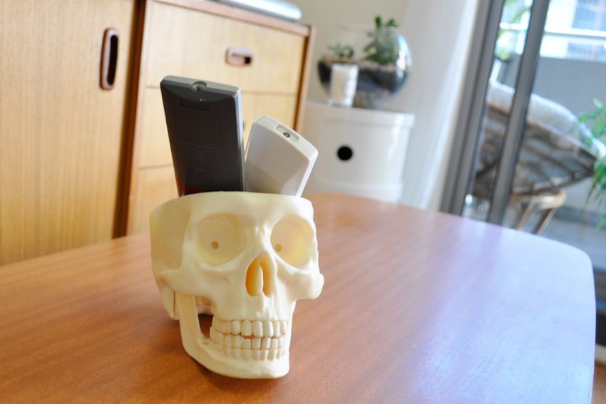
The skull that holds our tv remotes is from one of those children's collect the whole series to create the full set thingys from a newsagency. It was the 1st in the series and us such was at an introductory price of $2 and was the only piece we wanted, score!
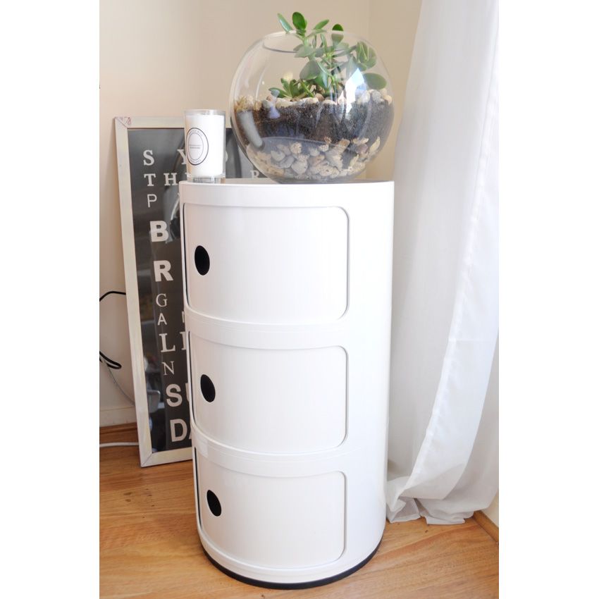
We made the terrarium (instructions on how to make one yourself coming this week) and it sits on a replica Kartel Componibili shelf from Matt Blatt for $99.
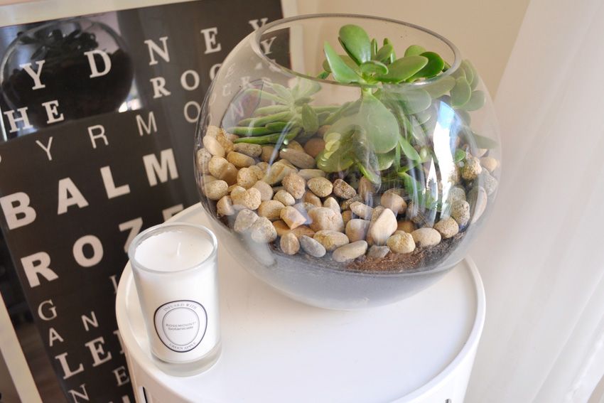
My sister gave me the Sydney bus destination scroll as a house warming gift.
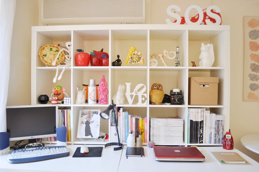
Our study area is bright and full of little pieces of inspiration from our travels.
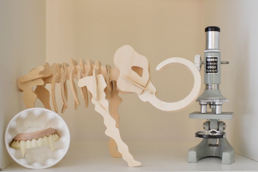
The teeth in cup is from an art event I held in art school called Swap Shop where the idea was to swap pieces of art for other pieces of art, and this is what I ended up with. The wooden Elephant is from a newsagency (I find some cool things at newsagencies it seems) The vintage Tasco microscope is from Savers.
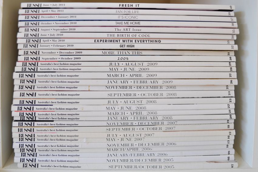
Missing a few issues here and there but still a great collection of my fave mag, Russh.
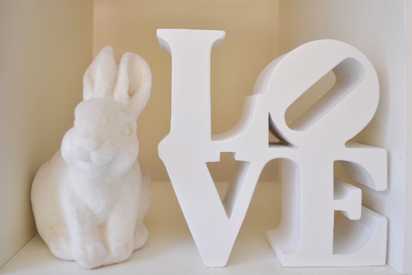
The bunny is from Tokyo and the mini replica Robert Indiana Love sculpture is from Typo. Henry and I have seen the sculpture in person in both New York and Tokyo so this is a nice little reminder.
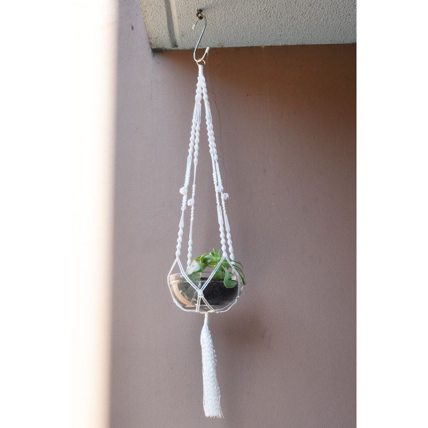
This macrame hanging plant holder is my first ever etsy buy, and I love it. It was a custom order from The Scarf Tree: Modern Macrames and it only cost me $16! My only wish was that the hook was on the other side of the balcony as it sits on the "ugly side" above the air con unit. As renters we're not allowed to put any new hooks in.
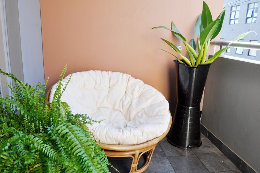
Here is the "pretty side" of our balcony. The fern and giant cane Papasan chair are both Surry Hills Markets finds, the later for only $100. The chair is so comfortable, its like sitting in a hug.
So that's our new home, and its sure to evolve and change over time just like my personal style. Already compared to our home in Melbourne its a lot more grown up, there are less bold hits of red and the colour palette is more subdued. I love interiors just as much as I love fashion, and often get jealous of my husband who works as an Interior Architect. I want to spend my days choosing tiles and finding the perfect chair for a client. Mind you he also does tricky architecture stuff I don't know anything about, I just like the decorating side of things. Well I hope you enjoyed the post and if you have any questions about where things are from that I may have missed I'll answer you in the comments below. xoxo

Such a lovely apartment. It's inspiring me to redecorate -- or at least clean up a bit!
ReplyDeleteRent in Australia is a joke. Melbourne is bad enough, Sydney is just ridiculous.
it's so tidy. it looks great. you're inspired me to clean up my apartment now.
ReplyDeleteYour new pad looks beautiful, Hayley. You've been really inventive with your furniture and arranged it well. Wishing you lots of happiness while you live there :)
ReplyDeleteI completely agree with Kathryn, rent in Australia IS a joke! (Especially in Sydney, it's insane!)
ReplyDeleteYour apartment is absolutely beautiful, Hayley.
Love seeing this. When we moved from Las Vegas to SF, our home took a similar change. We went from living in a 3 bedroom 2 bathroom house, to a small 1 bedroom1 bathroom place, so it's very difficult getting used to and condensing our furniture. But I like the challenge and am looking forward to changing everything.
ReplyDeleteyour place is fantastic hayley!
ReplyDeletegreat apartment! saved some of those photos in my inspirations folder
ReplyDeleteoh your apartment is awesome!
ReplyDeleteThe place looks great!! I think I prefer interior design posts more than fashion posts nowdays haha! Well done :)
ReplyDeleteSuch a gorgeous look in such a small space. Love it.
ReplyDeleteGorgeous. You have some amazing finds - especially that lounge!
ReplyDeleteI love what you have done with the place. So very cool. I love it. I'd have it all. Thanks for sharing.
ReplyDeleteLovely place, so tidy and coordinated!
ReplyDeletehttp://rachh90210.blogspot.com/
Gorgeous!
ReplyDeleteI have a terrarium post and giveaway coming up :P
You and I have similar tastes in interior design, please tell me where you bought that LOVE Sign?
ReplyDeleteThanks everyone! Happy you all like it x
ReplyDeleteElle Marie - The LOVE sign is from Typo, a cute Australian stationary shop. They have stores in Singapore too x
I always love such peeks in somebody else's home, especially when they look as pretty as this! The study area must be my favourite, I adore it! I'll so use it on my moodboard.
ReplyDeletehttp://crayon-sun.net
Hi Hayley, thank you for getting back to me! I'm in Tokyo, what a bummer I can't find it here, but I do have a friend that might be able to send it to me.
ReplyDeleteThanks so much!
looks beautiful!
ReplyDeletehttp://hannah-blogtanna.blogspot.com/
Hayley it looks wonderful! x
ReplyDeleteThis is a good website,I will visit you more often!
ReplyDeleteHave just stumbled upon your blog via the She Inspires website (where we're both listed in the Top 20 Australian Blogs) and have just spent a happy half an hour reading your archives. Absolutely adore your home - makes me miss that gorgeous, quirky, effortless Australian home style.
ReplyDeleteWill be back for more!
Briony xx
I just wanted to let you know how awesome your bookshelf is!!
ReplyDeleteI'm currently trying to re-arrange the books on my shelves, and I remembered your beautiful colour co-ordinated books from this post and I just had to come back and have a look for some inspiration :)
I hope one day my rental apartment looks half as good as yours does. We have about ten times the space yet only a quarter of the style. It's like someone dumped their op shop in our house.
ReplyDeleteNice cabinet.
ReplyDelete__________________
Outdoor Furniture
That apartment looks gorgeous. I like the color theme of the walls and furniture, it makes the place look more spacious specially when the sunshine comes in.
ReplyDeletewicker outdoor furniture
Love the 3rd picture, could be both a home or office.
ReplyDeleteThanks for this helpful post, That's really very helpful for me, Keep sharing like this...
ReplyDelete